
Revitalizing Vaccinology Research
2025
Canada's leading vaccine research collaboration needed a full digital transformation to match their groundbreaking research and engage diverse audiences effectively.
Healthcare
UI/UX Design
Design Systems
User Research
User Testing
Branding
Web


Overview
Team
→ 1 Designer (thats me!) → 1 Full Stack Developer → CCfV Comms Team
My Roles
→ UI/UX Design → Brand Design → Project Management → User Research
Software
→ Figma → Adobe Illustrator → Adobe Photoshop → Adobe Indesign
Deliverables
→ Wireframes → High-fidelity Prototypes → Design System → Brand and Style Guides

About CCfV
The Canadian Centre for Vaccinology (CCfV) is a leading vaccine research organization based in Halifax, Nova Scotia. It is a collaboration between Dalhousie University, IWK Health and Nova Scotia Health that conducts groundbreaking studies to advance public health.
Problem
CCfV's digital presence failed to match their scientific excellence, with a website plagued by poor navigation, cluttered information architecture and a dated visual identity. Their brand lacked sophistication while overly technical messaging created barriers for key audiences: potential study participants, investors, and research peers.
In addition, CCfV required an intranet based web-app for staff to view important internal documents, access directories and view upcoming news and events.
Solution
I delivered a complete digital transformation through a modernized brand identity, intuitive website architecture, thoughtful user flows and tailored content strategy for different audience segments, prioritizing the homepage and brand refresh to support immediate funding opportunities, while providing the design systems, wireframes and high fidelity prototypes and mock-ups for the fully updated website and intranet set to launch in early 2025.
Impact
The brand transformation has produced a massive increase in brand trust amongst the testers polled, along with a drastic increase in brand recognition.
The final results of the new website remain to be seen as it has not yet launched, but final prototype testing sessions showed improvement by leaps and bounds over the previous website: When tasked with finding a study using the new filters we devised, 100% of users were successful on their first attempt. User testing also showed a 120% increase in user satisfaction while using the site, and a speed increase of 4x for users seeking specific information set by our tests.
100%
Success Rate in Publication Seeking on User's First Attempt
120%
Increase in User Satisfaction Amongst User Tests.
4x
Increase in Speed Finding Required Information
Research & Discovery
User Journey & Flow
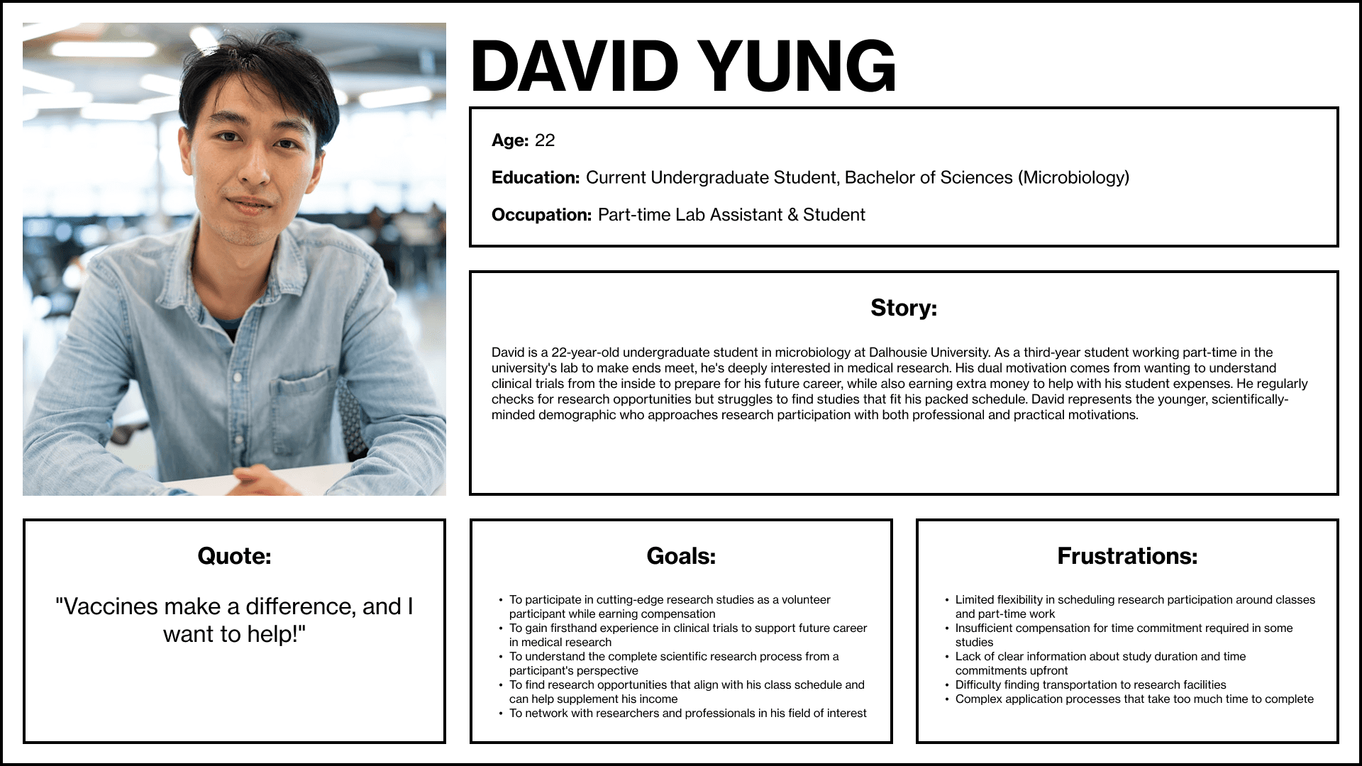
Through research using a group of first time users of various backgrounds, I developed three key personas (potential study participants, concerned parents/members of the public, and potential investors) to map critical pain points for the three major audience groups. User testing revealed 80% of participants struggled to find detailed information about research participation and current studies, while 60% of users reported frustration in learning more information about the organization, which would be addressed in rebuild. There was also a massive quantity of information the client wanted to be displayed on their website, which is always difficult to navigate for users. I had to come up with a clever way to access this information without overwhelming the users, regardless which audience segment they were in.


Brand Positioning
Stakeholder interviews uncovered a significant disconnect between CCfV's scientific leadership and their public perception. The organization needed to balance academic credibility with accessibility, positioning themselves as both innovative researchers and trusted public health advocates. The rebrand would have to address this!
Design & Development

Brand
I crafted a modernized visual identity that communicates scientific rigor and trust while remaining approachable. The new color palette integrates deep medical blue tones with warmer, human-centered accents, while the refreshed typography pairs a technical sans-serif with a more approachable secondary font. I am thrilled with how the logomark turned out, it is a geometric representation of a Y shaped antibody.
Design System
I developed comprehensive brand guidelines and a modular design system in Figma that ensures consistency across digital and print materials. The system features flexible component libraries with consistent typography, color application, and UI elements that maintain brand cohesion, all tokenized for ease of use, and quick iterating by the developer. The two typefaces chosen, Proxima Nova and Neuzeit Grotesk were selected for their legibility in digital space, and very forgiving on the eyes when reading larger texts such as publications. The colours were carefully chosen to adhere to WCAG guidelines.

Accessibility
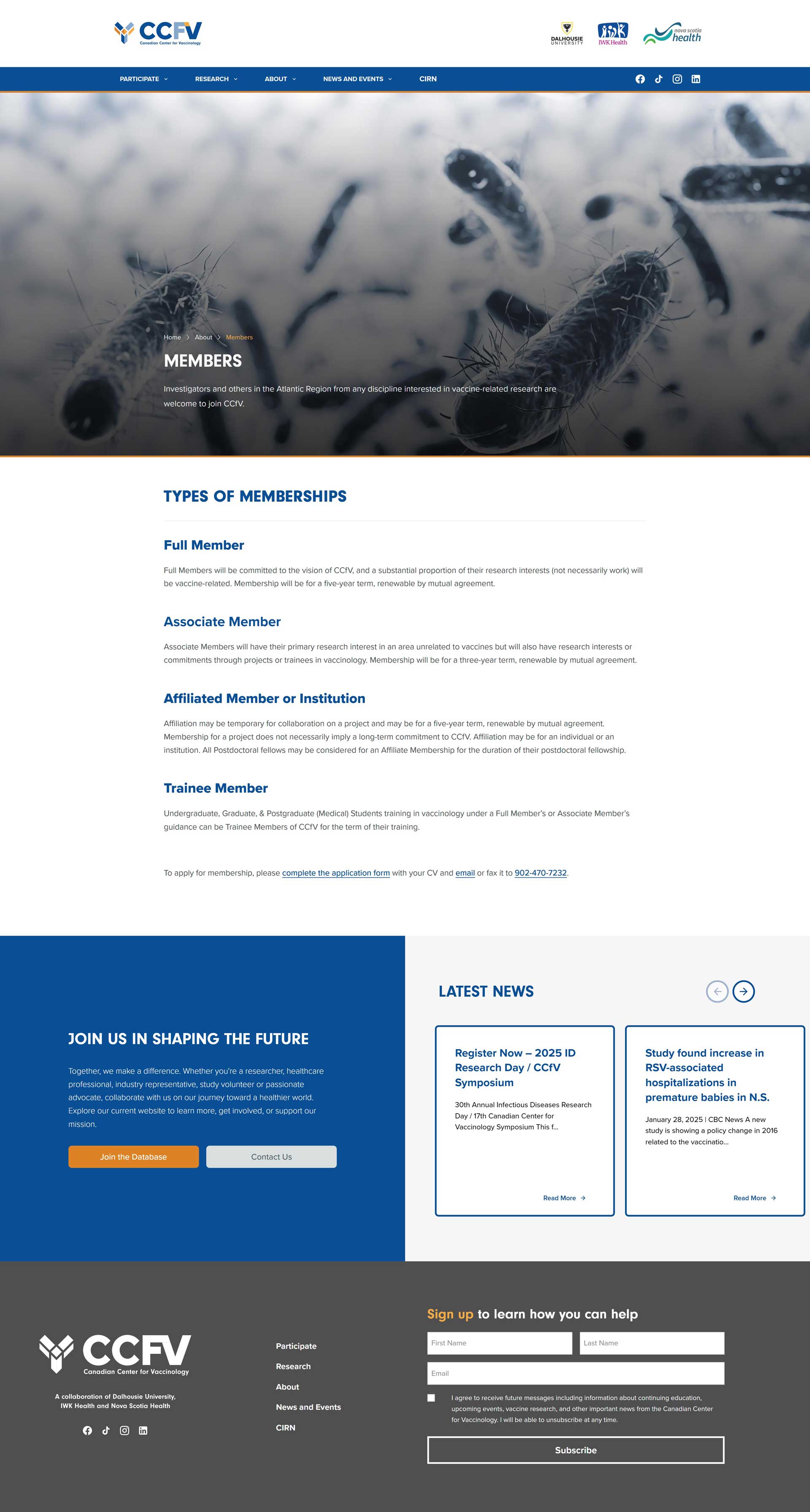
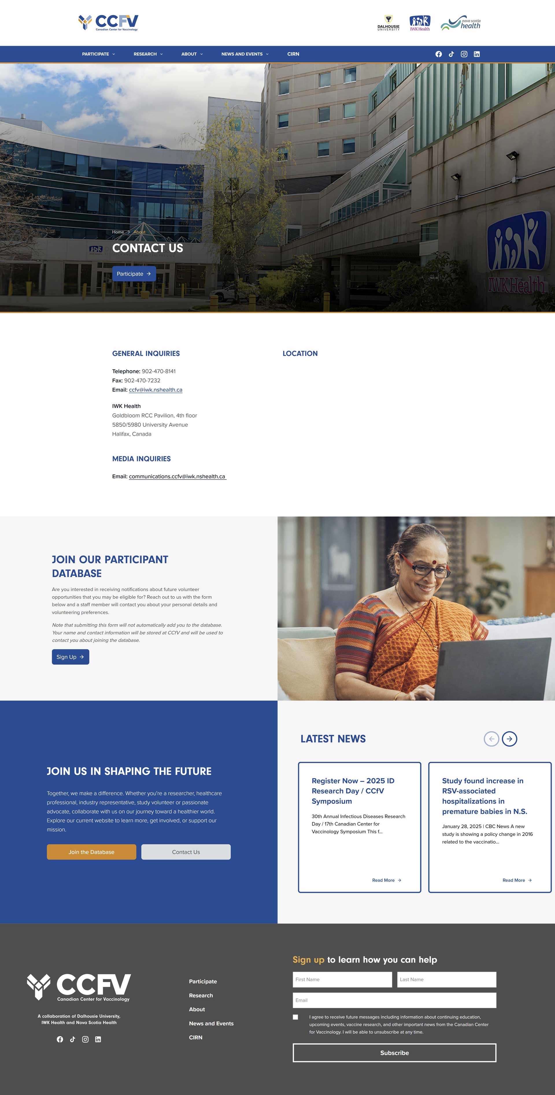
Perhaps the single most important thing about the CCfV project was making it accessible as possible. This includes adhering to strict WCAG standards, as well as making sure all typography, buttons and components were functional and easy to read. The final site will also be fully usable by switch systems and site readers for the differently abled. Easily discernable hovers and focus states are also found all over the website. The massive amount of information was neatly segmented into easy to navigate parcels through a mega menu that was active on both mobile and desktop platforms.
Testing & Iteration

Architecture
The client desired a very large quantity of information on their website to accommodate their key audiences. The redesigned website architecture features carefully designed pathways that guide different user groups to relevant content.
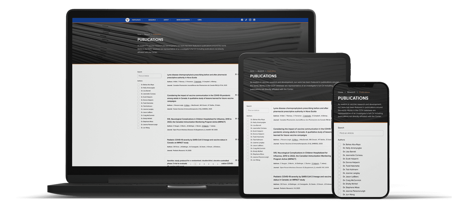
By implemented the aformentioned megamenu to simplify the navigation system, I was able to reduce clicks to get to key information in testing by 60%. We were also able to overhaul the study database section for the peer audience group, organizing research content in an elegant searchable database for improved accessibility.
User Improvements
Based on user testing with individuals representing all three research persona groups, I refined the sites flow to better highlight participation opportunities, research impact and CCfV's study database. Despite the massive amount of information available on the site, it remains fully accessible and easy to navigate for users.
We also developed an intranet component for the CCfV staff to enhance internal workflows, provide easy access to brand documentation and style guides and improve internal content management.
Reflections
Lessons Learned
This project reinforced the importance of balancing technical accuracy with accessibility in scientific communications. Technical oriented copy is fine for industry stakeholders, but public facing copy should be as legible and understandable as possible.
Early stakeholder engagement proved crucial for navigating complex institutional needs, and creating flexible implementation plans allowed us to adapt to changing priorities. We went through dozens of iterations versions before finally landing on the version of the project that we believe ticked all of the boxes!
Accessibility is paramount. If you are creating a product in the healthcare industries, you must make absolutely every effort for it to be as accessible as humanly possible.
Next Steps
The brand refresh has already launched to high praise from stakeholders and industry peers, and the current user testing of the final prototypes is underway, boasting massively improved search functionality, access to information, accessibility and user satisfaction! The full website is in the final testing phases and is scheduled for launch in early 2025. CCfV's parent organization CIRN was so pleased with the project that I have been contracted to re-design their brand and web experience as well!